—
By Dan Lennon
This narrative will consist mostly of charts. To begin, let’s review how carbon dioxide emissions have evolved since 1880 when the industrial revolution in the U.S. began in earnest.

Cumulative emissions before 1960 were only 20% of what followed. The important takeaway is this:
The crisis we are facing today is almost entirely due greenhouse gas emissions since 1960.
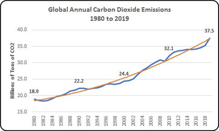
Now we’ll focus on the last 40 years, from 1980 to 2019.
Carbon Dioxide Emissions
This chart shows that annual global carbon dioxide emissions have doubled since 1980, from 18.9 billion metric tons to 37.5 billion metric tons. Two thirds of all man-made carbon dioxide emissions – about one trillion metric tons – have been produced since 1980.
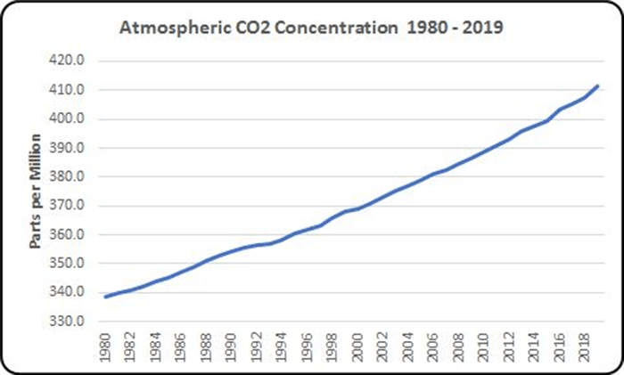
Carbon Dioxide Concentration
This chart shows that the concentration of atmospheric carbon dioxide has increased 73 parts per million since 1980 and is now (January 2020) 411 ppm.
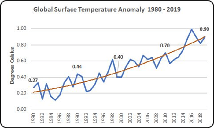
Surface Temperature
This chart shows that the average global surface temperature has increased .63 degrees Celsius since 1980. (An anomaly is a change from the norm.) This may not seem like much, but the surface of the Earth covers 197 million square miles, and the atmosphere weighs 5.5 quadrillion metric tons (that’s 5.5 million billion), so it takes a lot of heat to raise the surface temperature by one degree Celsius – in the ballpark of 5 quintillion joules. That’s five with eighteen zeroes after it, like so: 5,000,000,000,000,000,000 joules. This is equal to the energy budget of the U.S. for four million years. It’s a lot of heat.
Methane Concentration
After carbon dioxide, methane is the most important greenhouse gas. Sixty percent of the methane in the air comes from human activity; the other 40% comes from natural sources – mostly bacteria. This graph shows the increase in methane concentration since 1900.
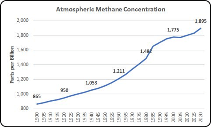
Methane is responsible for one fourth of the increase in the global surface temperature of the Earth. It is a much rarer gas than carbon dioxide, but a much more potent one in its ability to keep heat from escaping into space. For the first 20 years after emission it is 80 times more powerful than carbon dioxide. Over time it is converted into carbon dioxide, so averaged over the first 100 years after emission, it is 28 times stronger than carbon dioxide. Where carbon dioxide concentration is measured in parts per million, methane concentration is measured in parts per billion (ppb). In 1900 the concentration was just 865 ppb. In 1980 it was 1,482 ppb.
The rise in the concentration of methane slowed between 1985 to 2005, but since then has begun to accelerate again. Increased natural gas production in the U.S. may have something to do with it. Natural gas is almost entirely methane, and it may leak during the recovery process, when being piped overland, or when being transferred to or from ships.
Arctic Ocean Ice Melt
A portion of the heat that the greenhouse gases prevent from escaping into space go to melting ice. Ice everywhere is melting much faster than scientists expected. One place that is drawing a lot of attention is the Arctic Ocean. It sits on top of the world with the North Pole near its center. There is no land up there. At 5.4 million square miles, it is the smallest of the oceans, but it is still one and a half times the size of the U.S.
It shouldn’t be a surprise that the Arctic Ocean is frozen all year round, but during the summer, when it warms up, it has less ice. What has climate scientists concerned is the decline in the amount of summer ice. This is the time when the ice is at its minimum extent, and this minimum extent has been going down dramatically, as shown in this chart:
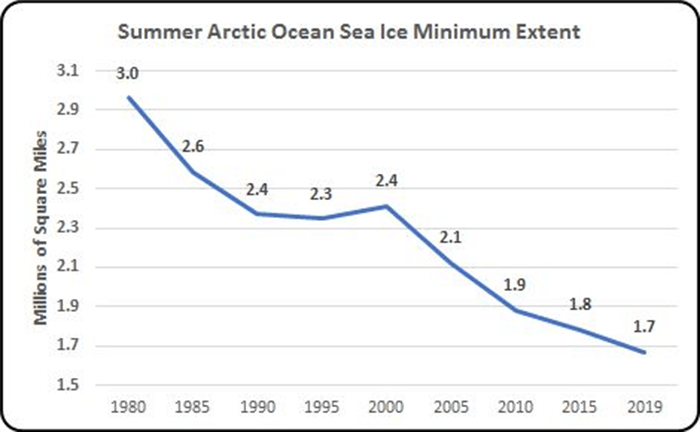
Since 1980 the amount of summer sea ice has almost dropped in half. At the present rate, climate scientists think that in another fifteen to twenty years the summer ice may disappear completely. That will have many consequences. One big consequence is that the albedo (reflectivity) of the Earth will decrease. Sea ice reflects around 90% of the sunlight that reaches it, but ocean water only reflects 6%. This means that an ice-free summer Arctic Ocean will absorb much more heat, and this will accelerate global warming. This is a positive feedback loop. There are many positive feedback loops involved in climate change, some known and some unknown, and they are why scientists are concerned that the pace of climate change in the future will accelerate much faster than we think.
Greenland Ice Sheet Melt
The Greenland Ice Sheet (GIS) is an enormous layer of ice that sits on top of the island of Greenland. The ice sheet is 1,500 miles north to south and 1,100 miles east to west. With a surface area of 660,000 square miles it covers 80% of Greenland. It ranges in depth from 1 ¼ miles to almost two miles, with an average depth of about 1 ⅓ miles. It has a volume of 695,000 cubic miles and weighs 2,873 trillion metric tons.
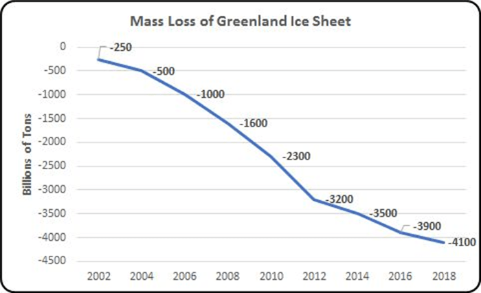
In the 20th century Greenland lost about 9 trillion metric tons of ice. Tracking the ice mass loss of the GIS became much more accurate in 2002 when satellite telemetry data became available. The chart shows that between 2001 and 2018 the Greenland Ice Sheet lost 3.8 trillion metric tons. This means that in 17 years it lost almost half as much ice as it had in the preceding 100 years.
Ice loss during this period averaged of 223 billion metric tons a year – about ten time the annual loss in 2002. In 2012 it lost a record 458 billion metric tons. Since then the annual rate of loss has decreased to around 100 billion metric tons due to a change in ocean currents that brings colder water to Greenland. This is a cyclical change, however, and in 2019 the GIS lost 329 billion metric tons, well above the 2001 – 2018 average. With unabated fossil fuel emissions, we can expect that this rate will continue to increase.
The obvious consequence of the melting of the GIS is sea level rise. Every 360 billion metric tons of ice melt produces a one millimeter rise in global sea-level. During the 20th century the GIS contributed one inch to sea level rise. The 4 trillion metric tons of GIS ice melt since 2001 has raised the sea level by another half inch.
Since 2002 new features – fissures and moulins caused by rapid ice melt – have accelerated the ice loss. Fissures are surface cracks that channel meltwater to moulins. Moulins are large, roundish, nearly vertical shafts that extend to the bottom of the ice sheet and allow meltwater to penetrate to the bottom of the ice sheet where it serves as a lubricant, enabling the ice to move more quickly towards the sea. This faster movement of the ice sheet accounts for about half of its ice loss. Scientists fear that the whole ice sheet has become so fragile that we may have crossed a tipping point from which will cause a much faster rate of ice melt in the near future.
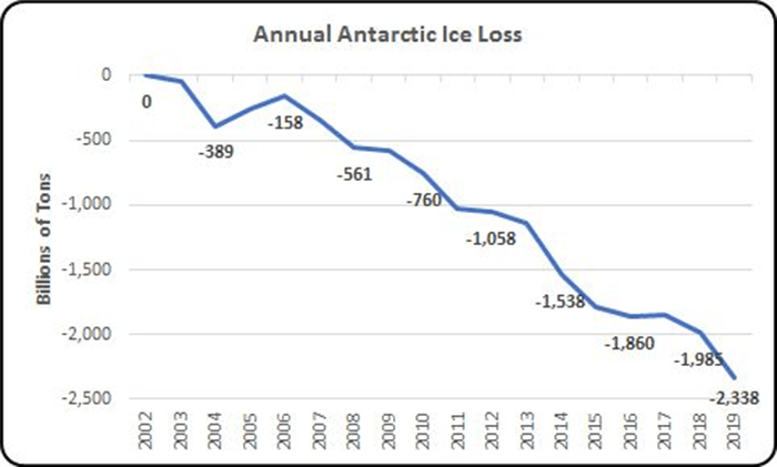
Antarctic Ice Sheet Melt
This chart shows that, from 2002 to 2019, Antarctica lost a total of 2.3 trillion metric tons of ice. If you include the preceding decade (1992 to 2001), it has lost 3 trillion metric tons of ice, enough to raise the sea level around the world by almost one third of an inch.
 Data from NASA’s GRACE and GRACE Follow-On satellites
Since 2010 the rate of ice loss has been twice as fast as during the preceding eight years. Most of this loss (84%) is coming from West Antarctica where vast ice sheets protrude hundreds of miles into the ocean where they are more easily melted by the warming water. These ice sheets hold back land-based glaciers, so as they melt, the glaciers can flow into the ocean and raise the sea level. East Antarctica has seen less melting because most of its ice is above sea level where it is insulated from changes in the ocean’s temperature.
Sea Level Rise
The next chart shows sea level rise since 1960 and latest projected sea level rise through 2100.

Sea level rise is the result of thermal expansion and ice melt, but increasingly ice melt is dominating, so this chart shows the same accelerating trend as the chart for ice melt. The effects of ice melt from Greenland and Antarctica will push sea level rise to two feet by 2050 and to six feet or more by the end of the century. (The projection is mine and assumes that the Greenland Ice Sheet and West Antarctic Ice Shelf will continue melting at accelerating rates.)
Natural Disasters
This chart shows the number and CPI-adjusted cost of natural disasters in the U.S. by year.
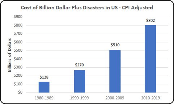
These disasters are wildfires, floods, droughts, hurricanes, tornadoes, and severe storms. The increase in the number and severity of these events is the result of a warming planet, and since man is responsible for this warming, the adjective “natural” is not quite accurate, is it? They are natural only in the sense that they involve nature.
Conclusion
By every metric, climate change is getting worse at a quickening pace. If all this happened in the last 40 years, consider what will happen in the next 40 when our starting point is so much worse and when there are no signs that the world is going to stop burning fossil fuels. In fact, it is expected that fossil fuel emissions will GROW by almost 25% in the next 30 years. That could change if we got serious about climate change, but even then, the scale of what is required is enormous and the time in which it must be done to avoid cataclysmic consequences will be even shorter than it is now.
—
Previously published on emagazine.com and is republished here under permission.
—
***

If you believe in the work we are doing here at The Good Men Project and want to join our calls on a regular basis, please join us as a Premium Member, today.
All Premium Members get to view The Good Men Project with NO ADS.
Need more info? A complete list of benefits is here.
Talk to you soon.
—
Photo credit: iStockphoto.com
